When crafting bouquets, the flowers’ colors have a huge influence on how stunning the final product will be. But beyond the aesthetic aspect of making bouquets, colors also influence the kind of emotion and message the recipient will receive from the bouquet.
That’s why choosing the right colors is just as important as choosing the right flowers. However, choosing the right color will require you to understand which colors work best with each other and what each color means.
In this colorful guide, we’ll discuss how color theory works and the factors you must consider when choosing the right color for your bouquet. We’ll help you make bouquets that are both stunning and meaningful.
Understanding Color Theory
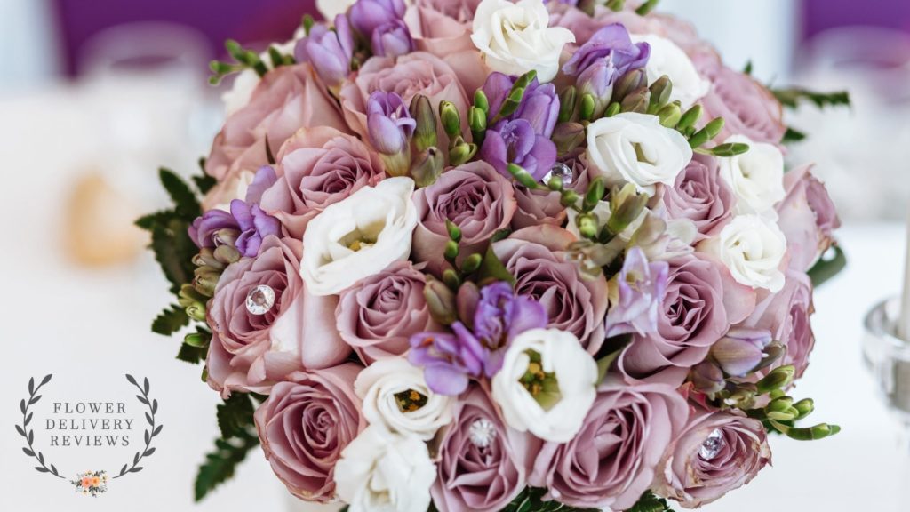
To be able to choose the perfect colors for your bouquet, you have to understand color harmonies. This will help provide a foundation for creating visually appealing color combinations.
To make it easier for you, it would be best to have a copy of the color wheel. The color harmonies we’ll discuss will use the color wheel, and it will be easier for you to understand when you have it with you.
Complementary Color Harmony
Complementary colors are those that are positioned directly opposite each other on the color wheel. These colors complement each other, hence the name, and create a strong contrast.
For example, a red flower would complement a green flower or green filler since they sit opposite each other in the color wheel. Another would be blue and orange, which surprisingly work well with each other despite being bold colors.
We usually use these complementary colors to create dramatic, impactful, and striking bouquets. They provide a huge contrast in the arrangement, making the bouquet bolder and more striking.
Analogous Color Harmony
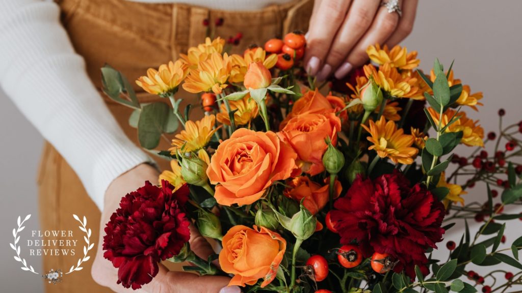
Bouquets that use flowers with analogous colors are a bit more soothing and subdued than those that use complementary colors. This is often mistaken as monochromatic, but these combinations use different colors that don’t contrast with each other.
Analogous colors are those that sit beside each other in the color wheel, so they give a more coherent and harmonious look when paired together.
We usually like using three analogous colors, like red, violet, and red-violet, to provide more variation to the bouquet.
If you want to create warm-looking bouquets, you can use red, orange, yellow, and those near them. You can use colors from the other side of the wheel, like purple, blue, and green, if you want a cool-looking arrangement.
Split-Complementary Color Harmony
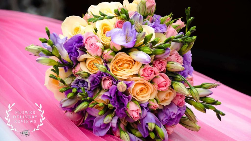
When using split-complementary color schemes, you choose a base color and then use the two colors adjacent to its complementary color. It’s different from complementary color harmony, where you use the direct complementary color.
For example, you want the bouquet to be mainly yellow. Instead of pairing it with violet, its complementary color, you’ll pair it with red-violet and blue-violet, the colors next to violet.
You can create a softer contrast using split-complementary colors since the other two colors are analogous to your base color’s complementary color. If you find the right balance, you can make a bouquet that offers both contrast and harmony.
Triadic Color Harmony
To get triadic colors of a certain color, you just have to form a triangle on the color wheel with one tip pointing to the color you want. Basically, triadic colors are three evenly spaced out colors on the color wheel.
For example, the primary colors, red, blue, and yellow, are triadic colors. Another example of a triadic color scheme would be violet, orange, and green.
Bouquets that follow this color harmony tend to be brighter even when we use paler shades, though not as bright as those that use complementing colors. If you want a more toned-down bouquet, you can use a brighter orange and paler violet and green.
Monochromatic Color Harmony
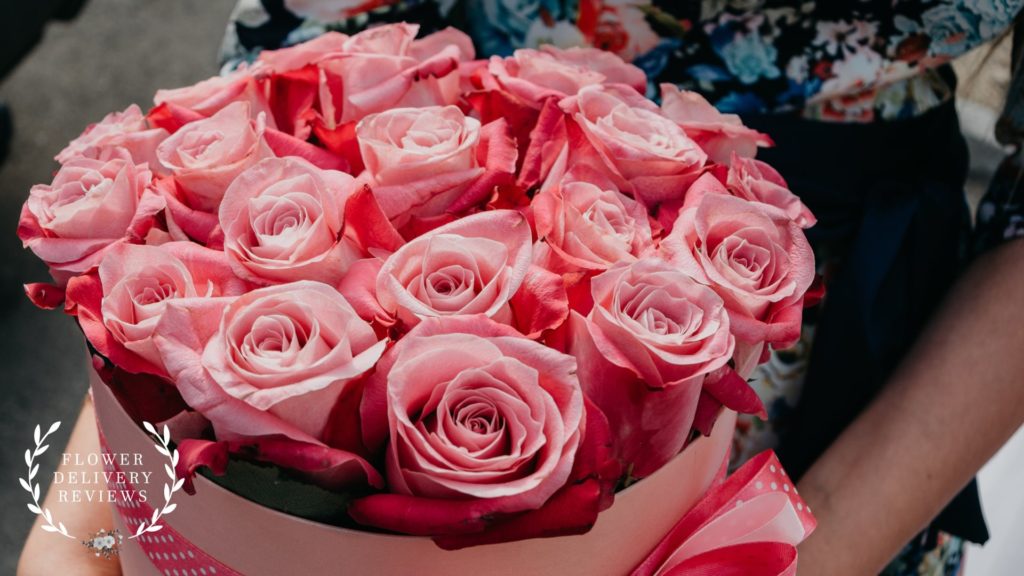
A monochromatic color scheme is probably the most popular to you since the name itself explains it. All colors that you’ll use in the bouquet are derived from a single color in the color wheel.
Unlike analogous color schemes that use different hues that are quite similar, monochromatic color schemes only use one color. You only use different shades, tints, and tones of the color by adjusting its lightness, darkness, and saturation.
When using monochromatic color schemes, you can choose flowers with different textures and sizes to create variation or stick with one flower if you want a simple bouquet.
Either way, you can create an elegant arrangement when using monochromatic colors.
Tetradic Color Harmony
When applying tetradic or double complementary color harmony, you’ll use two pairs of complementary colors, creating a more dynamic and bolder color scheme. When you connect the colors in the color wheel, you’ll form a rectangle or square shape.
Using this color scheme can be quite tricky since you’re using four different colors. It’s important to find a balance if you don’t want to make your bouquet look messy and uncoordinated.
One thing we love doing when using tetradic colors is choosing one dominant or base color and using the other three as accent colors. This is just one way to do it, though, and there are a lot of ways you can play with the colors.
Achromatic Color Harmony
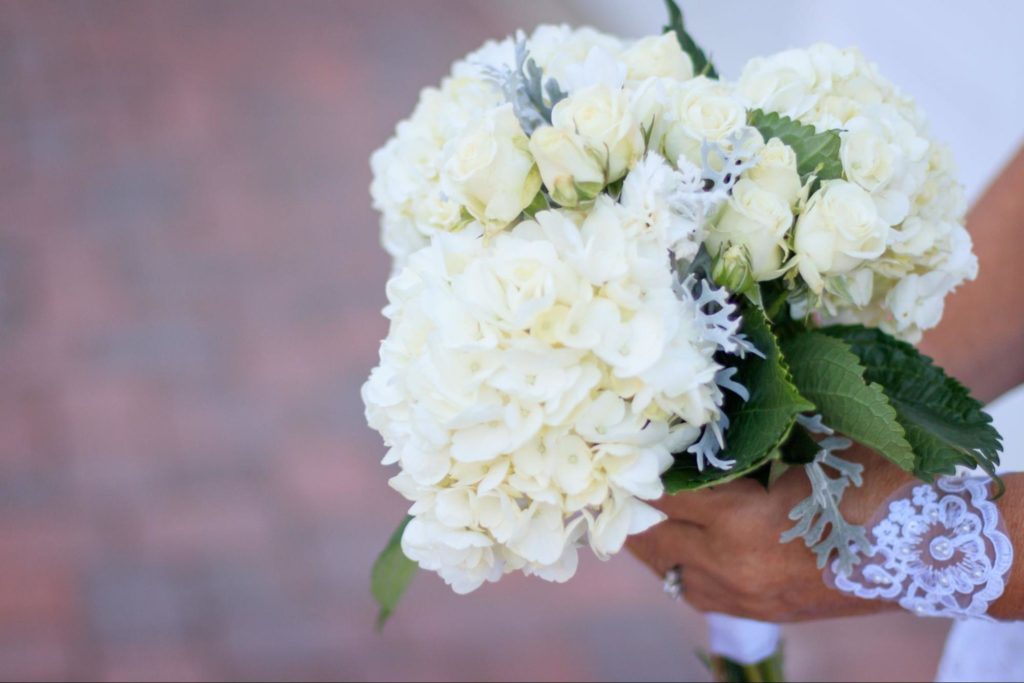
Achromatic color harmony uses colors that can’t be found in the color wheel or those that don’t have hues. These are really just black, white, and gray, but some people have also started using beige since it’s a neutral color.
While we rarely make bouquets that solely use achromatic colors unless requested, this color scheme has become trendy these days. It has a timeless charm that makes it perfect for bouquets made for formal events or parties with minimalist themes.
We usually combine achromatic colors with other colors in the color wheel since they go well with any color. We sometimes use them as base colors and add accent colors to make the bouquet more interesting.
Factors to Consider When Choosing Colors for Flower Bouquets
Occasion and Theme
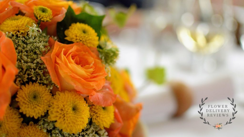
The occasion and theme of the event can have a significant effect on the colors you’ll use in the bouquet since each event has its own atmosphere and mood. Also, knowing the theme will help you coordinate the bouquet’s color to the event’s aesthetic.
Weddings
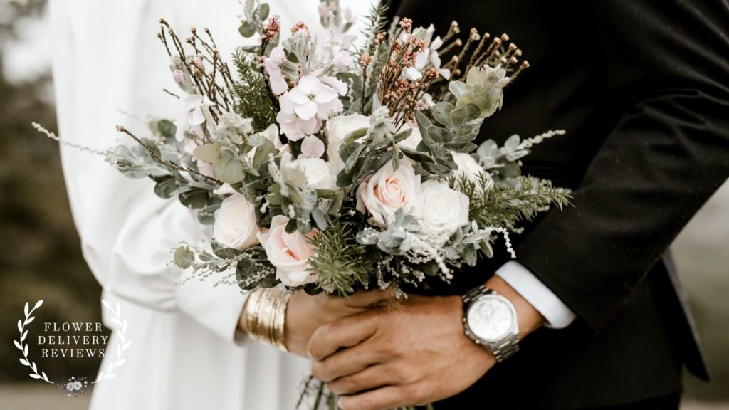
Weddings are celebrations of love, so you’ll typically use soft and romantic colors. Traditionally, you would use pastels, neutrals, and achromatic colors to match the dreamy mood weddings have.
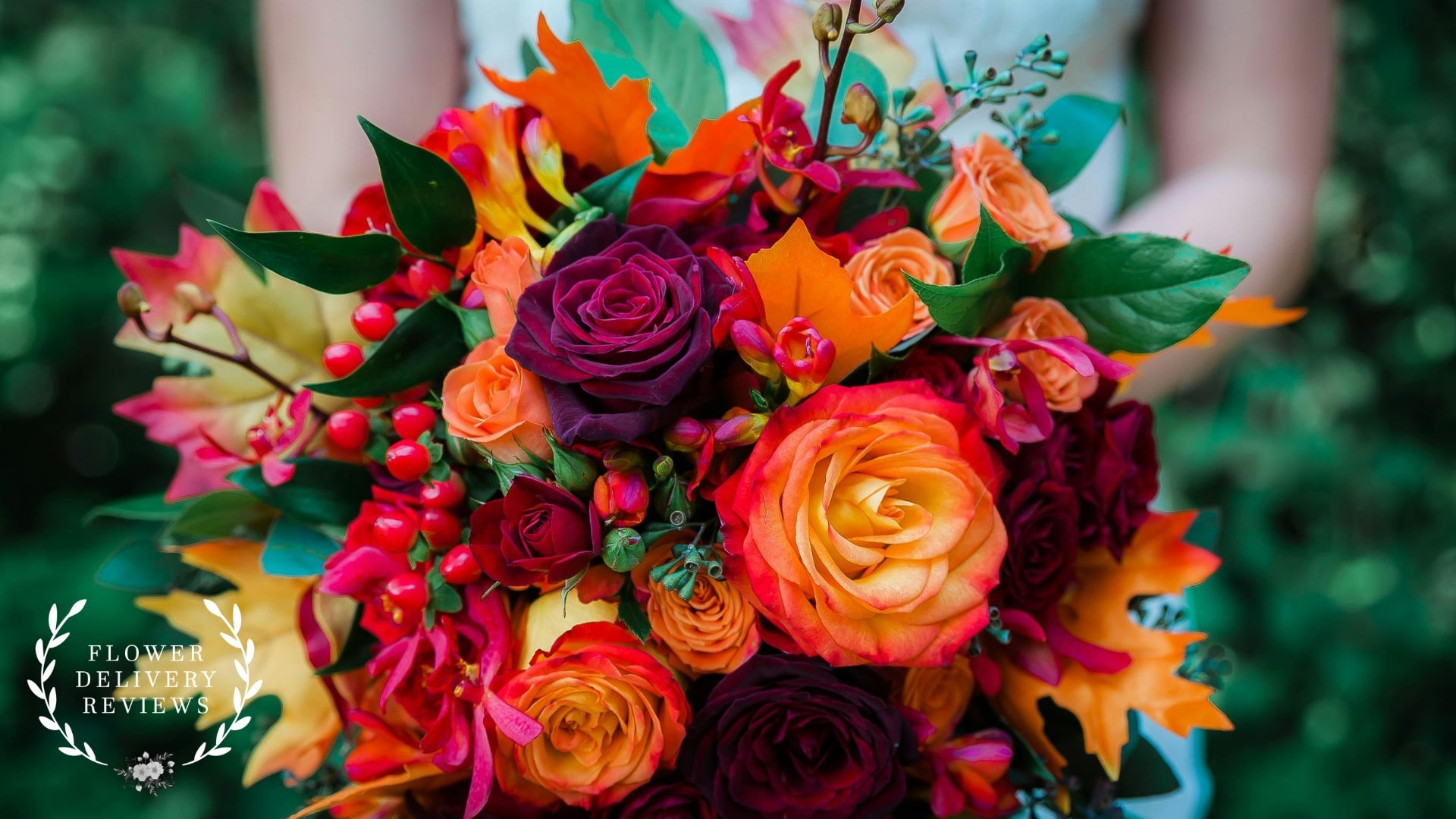
That said, many couples now also use bolder and brighter colors to make the atmosphere warmer and more exciting. Hence, it’s still important to know the overall theme and motif of the wedding to make a final decision on the colors of the flowers.
You can match the bouquet to the colors of the decors in the wedding venue or use colors that would complement and enhance the bride’s and bridesmaids’ dresses.
Anniversaries
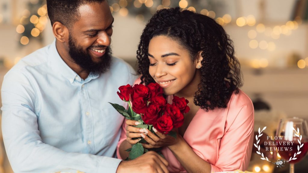
Like weddings, anniversaries celebrate the love that the couple shared. That’s why you’ll often find anniversary bouquets using red and pink colors since they’re considered romantic.
However, it doesn’t mean you can’t use other colors for anniversary bouquets. You can also use colors associated with specific years, like silver for the 25th anniversary and gold for the 50th anniversary.
Additionally, use colors that the couple personally likes or those that have special meanings to them. For example, you can use the main colors used during their wedding to evoke nostalgia and make the bouquet more meaningful.
Birthdays
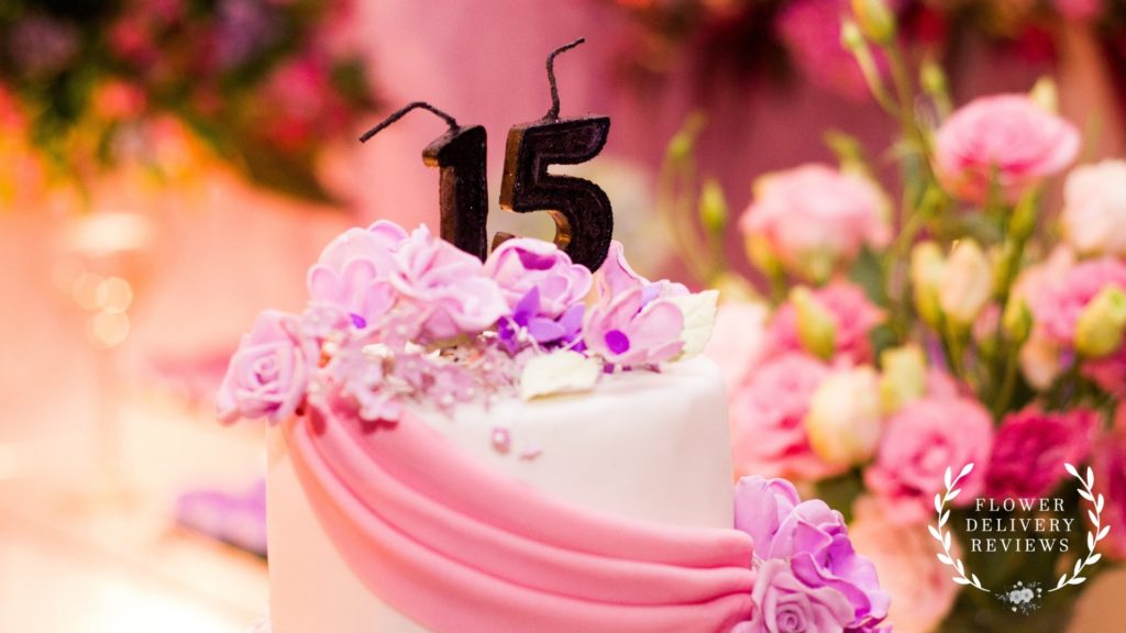
Birthday parties are very diverse, so you have more flexibility when choosing colors for birthday bouquets. There typically aren’t any norms regarding birthday bouquets that you have to follow or be mindful of.
For birthday bouquets, the most important thing to consider is the birthday celebrant’s personal preferences. Generally, we’d ask about their favorite color and work with that by applying color harmonies.
Some birthday parties are also more formal and follow a specific theme, so take that into account. For example, if they’re having a tropical-themed party, you would want to use warm colors like orange, yellow, and red.
Personal Preferences
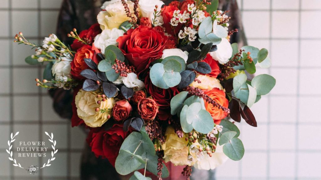
As we’ve mentioned before, personal preference plays a huge part in determining the colors for the bouquet you’re making. We don’t want to make a bouquet that uses colors the recipient or sender doesn’t like.
Recipient’s Favorite Colors
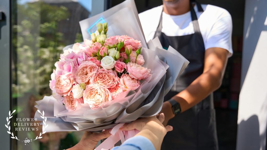
What’s a pretty bouquet and what’s not ultimately depend on the recipient’s personal taste. Incorporating the recipient’s favorite colors can make the bouquet look extra appealing to them since the colors are what they personally consider pretty.
Once you find out the recipient’s favorite color, you can choose other colors that will work well with it. It can be helpful to make their favorite color the dominant color of the bouquet.
Aside from tailoring according to their own aesthetic, using their favorite color can also show a sense of affection and thoughtfulness. It shows that you value their preferences and their individuality.
Sender’s Preferences
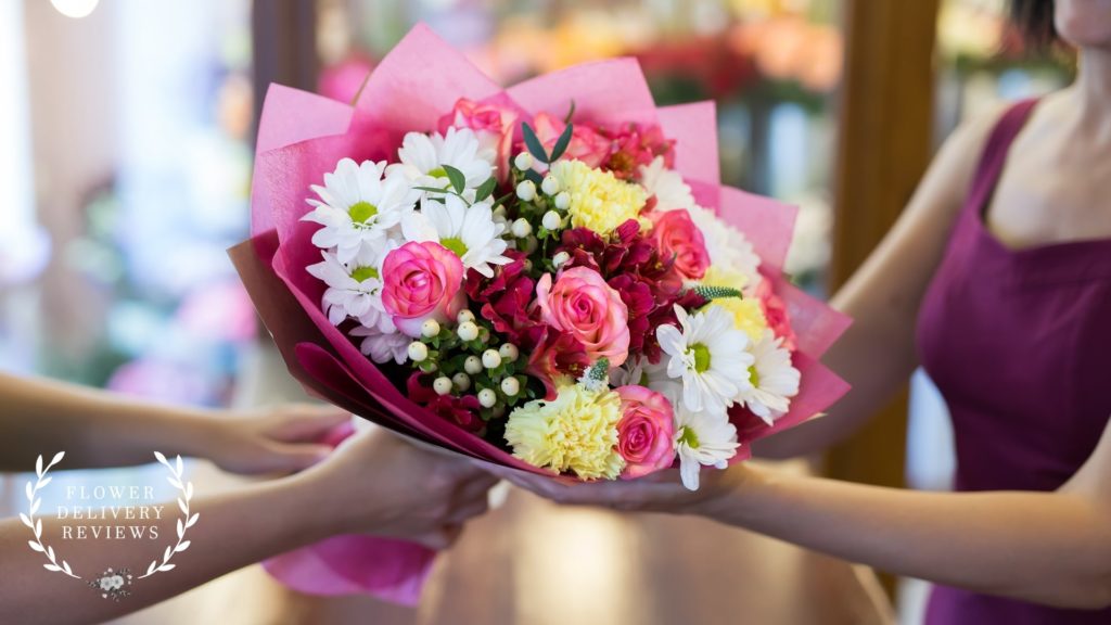
Many tend to think that the sender’s preferences don’t matter when choosing colors for the bouquets since they’re not the ones receiving them. But the truth is the sender’s preferences are just as important as the recipient’s.
When we gift bouquets to people, we don’t only do it because the other person wants to receive flowers but because we feel happy making them feel special. But who would feel happy gifting their loved ones something they don’t personally find beautiful?
Hence, don’t shy away from incorporating your own favorite colors in the bouquet. Florists won’t ask you what colors you want to use if they don’t find your input important.
Color Psychology
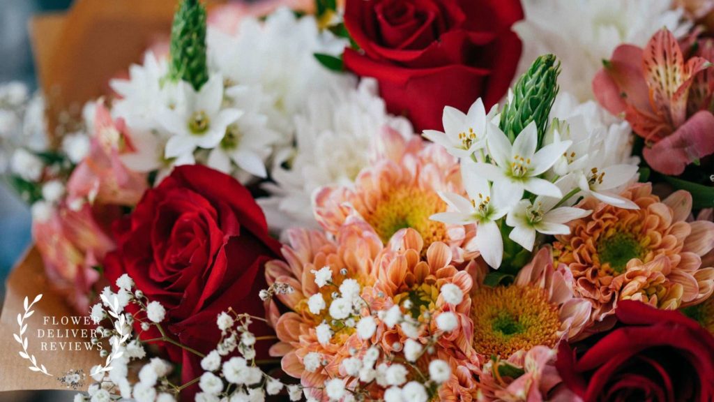
It may sound far-fetched, but colors can have a huge influence on our emotions, perceptions, and behavior. This is why it’s essential to consider color psychology when crafting bouquets to effectively convey certain messages and emotions.
Understanding color psychology might sound daunting, but you don’t really need in-depth knowledge about it just to craft bouquets. Understanding the basics can already make a difference in your arrangements.
Here are some basic meanings associated with certain colors that you have to remember:
- Red – Red color is often associated with love, passion, and romance. This is quite evident during Valentine’s Day when everything is basically red.
If the bouquet is meant for an event celebrating love, like anniversaries and dates, or if it’s a gift for a significant other, using red colors would be a great idea.
- Pink – Pink, like red, is often associated with love and affection. However, it’s used for a much softer and gentler type of love, like puppy love, first love, and even motherly love.
Pink flowers are often perfect bouquets meant for first dates, Mother’s Day, and baby showers.
- Orange – Orange is often associated with encouragement, excitement, and self-confidence. This is primarily because of its bright and warm hue.
Orange flowers are best for congratulatory bouquets, whether it’s for graduation, a new job, or any accomplishment. That said, they are also used for weddings, birthdays, engagements, and other events.
- Yellow – Yellow, as a cheerful and bright color, is widely tied with happiness, positivity, and friendship. If the bouquet is a gift for a friend, yellow flowers typically won’t create misunderstandings because of their meaning.
One tip, though: if you want to make a yellow monochromatic bouquet, use paler shades of yellow along with bright ones. Bright yellow can be overwhelming or have a disturbing effect if overused.
- Green – Green produces a calming effect since it’s often used to represent balance, harmony, and connection with the environment. This makes green bouquets perfect for events held outdoors.
- Blue – Blue, like green, produces a soothing effect. It’s often associated with peace, serenity, and tranquility.
Blue flowers are pretty flexible and can be used for any celebrations. They’re also becoming trendy accent flowers for weddings since blue symbolizes faith and loyalty.
- Violet – Violet and purple colors are often associated with royalty, respect, and dignity. This makes purple flowers perfect for making luxurious bouquets for formal events.
You can use purple flowers if you want to show respect for someone, whether it’s your parents, your grandparents, your bosses, or anyone you look up to.
- Black – It’s a bit harder to associate black with a specific meaning since it’s associated with both positive and negative connotations. On one side, it evokes power and elegance, and on the other side, it reminds people of death and evil.
Due to these associations, black flowers are often used for bouquets for events with black themes or funerals. Although there aren’t true black flowers out there, you can find some dark-colored flowers that almost look black.
- White – White looks clean and pristine, so it’s often associated with innocence, purity, and goodness. This is why white flowers are often used for baby showers, weddings, and funerals.

